
"Have Computer, Will Write."
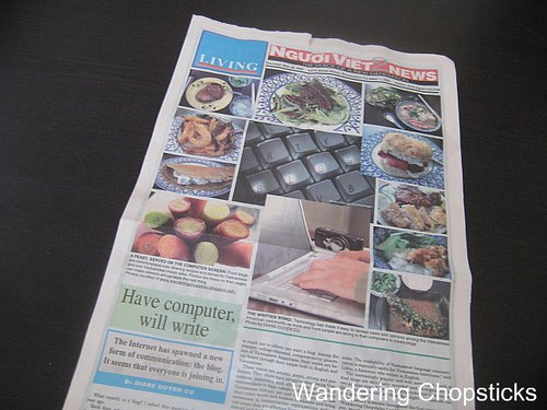
Think of a traditional broadsheet newspaper. That's the long page you see, in the picture above, that has to be folded in half to fit in news racks. All newspapers have a header. Sometimes below that there's a quick index that tells you what's in the newspaper that day. There's often a big picture with the lead story of the day, or at least a nice photo so the top half of the page looks good. And a headline with the lead story of the day.
In newspaper design, there's the concept of "above the fold." The top half of a newspaper is what you see in news racks or on your doorstep. Obviously, newspapers want to place the catchiest photos and headlines in order to grab your interest. This is especially crucial when you can get the same information from other newspapers, so why should you choose them?
How does this translate to blogs?
When you initially click on a blog, what do you notice? Is it the masthead? Index? Headline? Photos? You want your best content out there. People are lazy. I am lazy. You have 1 second to get someone's attention. Maybe you have 3 seconds. If your header is so big that I don't even see the content at first glance, if the layout is so busy that I can't find what I'm looking for, if your photos aren't compelling, if you have so many gadgets on your page that it takes more than a few seconds to even see the page, you've just lost me as reader.
So let's break this down into each part.
Newspaper headers identify the publication so you know what you're reading. Some headers may by more interesting than others, but they don't take up half or all of the space "above the fold." Newspapers need to save room for an index, headline, photos, and text. But some blogs have such elaborate headers that that's all you see at first glance. Then you have to click down to even see the content. Unless your masthead is so gorgeous that people will want to see it each and every time they visit, keep your header short. Size matters. Save room "above the fold" on your blog for your content.
Have an index or navigation bar. Link to major categories such as an about page, a way to contact you, and most importantly, your recipe index. Got popular posts or a series you want to promote? Stick that up there. Do you have a user-friendly archive so visitors can find information? If you've got hundreds of recipes but no easy way to find them, then no one's looking at them. I would encourage you to create an index that works for you. It can be a drop down menu or archive pages. Your archives can be as simple as an alphabetical list to lists with subcategories like what I have. In Blogger, the easiest way for me to do that was by creating separate pages and dividing them into recipes by category, recipes by cuisine, and Vietnamese recipes by category. Restaurants are divided into restaurants by city, restaurants by county, and restaurants by cuisine. And if you don't have an archive, at least show off some of your best posts in your sidebar.
It was a pain to create those archive pages and to consistently maintain them. But, I regularly get visitors who use those list pages to surf around my blog. They click on the category that's of relevance to them and keep clicking around as they go down the list. Next thing they know, they've been on the blog for four hours or more. Often, that's how someone who clicked over from another blog, or who found me from a search, became a regular reader. This happens several times a week judging from my stats and emails. If nothing else, an easy to navigate archive means your regular readers can find information. All that clicking around also increases your number of page views, which literally pays off if you have ads.
Photos draw in readers and serve to break up heavy text. Here, let's stick in a random photo since I've been typing for several paragraphs now.
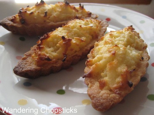
Banh Dua Nuong (Vietnamese Coconut Tartlets).
Several hundred years ago, printing was expensive so newspapers squeezed as many words as they could fit on a page. They were often the only source of information so it didn't matter what the newspaper looked like because people would read them anyway. Then USA Today arrived in the 1980s and changed newspaper layouts forever. While no one reads USA Today for the writing, its colorful layout, graphics, and shorter stories meant the information was easily accessible at first glance. The stories were shorter because people often didn't like having to turn the page to read "after the jump." Similarly, you don't want your blog to be text heavy. People like pictures. Sometimes they only look at the pictures.
This is personal preference but if I have to click too many times to get to the content, I often only look at the truncated post. I don't click to read more and I don't click again to leave a comment. Some blogs have partials on their front page and you have to click to get to the rest of the post. Some people like this because you can fit more posts on a page without all the extra photos slowing down load times. Some bloggers do it to cut down on people stealing their content. This also increases page views, an important factor when you have ads. All of which is fine, I can handle one more click. But if the click doesn't result into a drop-down with the rest of the post and opens into a separate page, which requires me to have to click back if I want to see the next post on the blog, that's gonna cut down my view time. Or if the blog comments don't open into a pop-up window but a separate page, so that I have to click back to the original post and then click again to get back to the main page to see the next entry, they've just lost me as a commenter. I might check sporadically to look at the posts, but I have to really think twice before I want to click to read the rest of the post, and then think thrice whether to click again to leave a comment. Create too many obstacles to get to your content and only the truly dedicated reader would be willing to go through all that just to read a blog post or leave a comment.
Your overall blog design doesn't have to be fancy, but it does have to be easy to navigate. Can someone visiting your blog for the first time be able to find what they're looking for? An intuitive navigation bar is often the easiest way to do that. If you have to write directions in order for people to find information on your blog, perhaps you need to sort the information in a different way. Are your headlines obvious enough that visitors know what they'll be reading? Do your photos lure people in and break up excessive text? How many clicks do you make people go through before they are able to access your posts and leave a comment? Just how many clicks does it take to get to the center of a blog? ;)
- How to Start a Food Blog
- On Blogging and Food Blogging
- Choosing a Blog Host
- Picking a Name: Be Clever, Original, and Memorable
- Posting: Frequency, Topics, and Accuracy
- Giving Credit: The Right Way to Link, Copyright, and "By," "Inspired," and "Adapted"
- Your Online Identity: Blogging Interactions and Comment Policies
- Photos: Photography Tips, Storage, and Watermarking
- Design: Layout, Navigation, and "Above the Fold"
- Blogrolling: Will You Be My Friend?
- Building Traffic: Participate in the Community and Respond to Your Stats
- Measuring Success: Cheerleader or Nerd?
- Public Relations: Handling the Freebies and the People
- Monetizing Your Hobby: To Ad or Not to Ad
- Bottomline: Have Fun, but Protect Your Work
*****
1 year ago today, baked figs stuffed with walnuts, wrapped in prosciutto, and drizzled with honey.
Agreed that accessibility, ease of navigation and reader-friendliness is key to a good blog layout.
ReplyDeleteI am still conflicted on whether to make my posts expandable/truncated. Most of the time I don't like having to do that extra click to read the full post, but sometimes it's nice to just quickly scroll through opening pictures and the lead paragraph(s).
"Next thing they know, they've been on the blog for four hours or more. Often, that's how someone who clicked over from another blog, or who found me from a search, became a regular reader." I hope it wasn't four hours, but that was definitely me at the beginning!! I remember looking at your recipes for a while...
ReplyDeleteHC,
ReplyDeleteI say no. That extra click really does me in. ;) And you can easily quickly scroll down multiple posts at a time.
Miss.Adventure,
I don't know what it is about the 4 hour mark, but it always seems to be so. Not 3 and not 5, but always 4. :)